#1: Baby Driver
- 17amymay.kelley

- Jun 11, 2018
- 6 min read
Updated: Jun 19, 2018
Produced: Working Title Films, Big Talk Productions and Media Rights Capital
Distributed: TriStar Pictures and Sony Pictures Releasing
Director: Edgar Wright
Genre: Action/Adventure/Drama
Synopsis: More than just a prodigiously talented go-to getaway driver for heist mastermind Doc (Kevin Spacey), Baby (Ansel Elgort) is a music-loving orphan with a soundtrack allocated for each job; Baby ensures Doc's violent, bank-robbing cronies including (but not limited to) Buddy (Jon Hamm), Bats (Jamie Foxx) and Darling (Eiza Gonzalez)- get in and out of danger before it's too late. However, Baby wants out, hoping to nail one last job before riding off into the sunset with beautiful diner waitress Debora (Lily James).

UK Poster: This theatrical poster for Baby Driver is one of many variants, but it is consistent with the minimalistic, bright/vivid artistic and fairly unique and modern marketing strategies that act as Enigma Codes to the audience, ie. what, in this movie, is the correlation between guns and cars? Does this imply a hit and run, a heist, etc? The juxtaposition between such implications and the name 'Baby' allude to perhaps a misunderstood element of crime and criminals, henceforth targeting the audience as slightly higher than 18, veering away from interference with a child's moral compass which needs to develop right and wrong (Bandura), effectively keeping the production company out of responsibility if younger people are influenced by this movie and the violence.
The implications of the font used, albeit fairly generic, retro and perhaps cheesy, seems out of place on a hot pink background as it seems almost military, used for movies such as 'A-Team', which contrasts from the traditionally 'feminine' colour and aesthetically pleasing art-work. This Semantic Code potentially promotes a sense of love and perhaps innocence (despite the criminality) throughout the film, and how this is the more prevalent theme than the guns and violence as it undoubtedly dominates the poster. However, the pistol and whirring car are integral to this poster and the connotations as it does still symbolise the danger within the movie, and how this is for an older audience, one that would find this suitable/appropriate in contemporary society.
The layout of this poster drags your eyes across, the straight lines promoting a sense of journey to reveal the title of the movie but it also Symbolises the importance of art and aesthetics as it looks like sound wave frequencies, connoting that music is an art and it is important. Though in smaller print, directly below Edgar Wright's name is revealed as if it were a staircase (we are shown information directly after another piece), providing the movie with a stamp of authenticity due to his notoriety with the Shaun of the Dead, Hot Fuzz, Scott Pilgrim Vs The World, etc. and has subsequently attracted a loyal fan base that share an interest in the arts and culture, very much what this film translates. The inclusion of the name very well may be a marketing strategy as though this is not solely a star-vehicle, there are many well-known names. The decision to exclude them from this poster lends some kind of modesty and respectability, but also has a distinguishable colour and style about it that is recognisable in various other forms that the movie chose to market.

Very similarly, this poster is also minimalistic and whilst I will discuss this poster more concisely, I thought it was worth the mention as this carries a different font than the rest of the film marketing as it is far less aggressive and action-packed. This connotes that the audience is opened up to fans of action, heist, romance, artsy and music films, and whilst there are posters that focalise all of those simultaneously, this poster hones in on the music and the importance of that. The splitting of the earphones into two, emulating a road, symbolises the choices characters have to make, and how this provides entertainment (Uses and Gratifications) as we know we will relate to some characters for reasons such as celebrity attraction, character arcs, etc. so this decision making also rather excites the audience through the high-speed chases that align with the music as we can evidentially see that the two coincide rather well; music lovers will understand the references/songs, whereas a more general audience can just appreciate that it goes well with the high-octane action. *Go back, edit and add more

American Poster: Whilst this poster may conform to everything a modern day audience is distasteful of in a poster, we can look past the floating, contemplative heads and city skylines (specifically Atlanta, perhaps attracting an audience via poximity relation) for the unique selling point that the poster is hand-illustrated; this alludes to Neale's genre theory as though it is consistent with old aspects of traditional looking action films, this artistic flare provides it with a sense of modern, contemporary fascination as it clearly had a lot of effort put into it. This altruistic effort makes audiences feel compelled to prioritise Baby Driver as it appeals to a mass audience; the action-packed car chases, the artsy feel, the city-scape, the celebrity performances, the music references, the romance that is all displayed in one confined poster which effectively and correctly translates the energy of the movie.
There is a eccentric, yet limited colour palette for this movie as the pink dominates the poster, for even the red car and red jacket Jamie Foxx's character clads has a pinkish tint to them, again, connoting romance as Ansel Elgort (Baby, the protagonist) takes the lead and pink surrounds his head, implying that he has some sort of romantic plot as well as the action plot. This attracts an inherited audience from his previous romance cult-classic 'The Fault in Our Stars', and whilst he plays a completely different character here, there is some sense of familiarity. The aforementioned red on the car and jacket allude to some sort of danger and ominous aspect which prompt Enigma Codes of the antagonism of Foxx's character, car crashes, etc. Furthermore, the enigma surrounding the antagonist as Kevin Spacey's character as he looks rather suspicious, like an archetypal corporate body villain, the black suit promoting his mysticism and the power in which he dominates the poster as he has an authoritative entity about him. Although the media strife over Spacey came out after this movie, it may shine his character in a slightly enigmatic light to audiences.
This danger is further connoted to by the indexical signifier of the red and blue lines rushing past the police cars, again informing the audience of the crime and action of the movie, confirmed undoubtedly by Jon Hamm's character holding an assault rifle, connotations of extreme violence which are furthered by the tattoo on Foxx's hands, the symbol he threateningly displays and Gonzalez's character holding a gun. This film seems to challenge the ideology of shying away from violence in contemporary society, where gun laws and the effects are of controversial nature; this is daring and traditionalistic in a sense, yet seems almost refreshing for an audience.
The criminals, due to this, are represented in an arguably negative light due to the threat they seem to pose, yet as they do not take as much space as the protagonist, this shifts into a slight admiration perhaps, as alluded to by the action that some fans may be intrigued by. Foxx, of all characters, seems to be the most antagonistic for his display of violent colours and his hand gesture which directly guides our eyes towards Baby and his girlfriend, a Semantic Code of how he may cause them trouble within the plot.
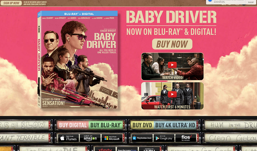
Website: http://www.babydriver-movie.com/discanddigital/

The website, albeit conventional for movie websites, manages to translate the movie's tone rather well. It seems cluttered and chaotic with conflicting and contrasting colours, messy handwriting and abundances of smoke, however it doesn't look unprofessional nor unsurpassed. The tapes at the bottom, of significance in the movie, have promotional references that slot in amongst the 'actual' tape decks. This provides the website with some authenticity for innovative design that actually relate to the movie and the plot. There are some clips, perhaps allowing the audience to feel privileged by being able to 'watch the first 6 minutes', perhaps appealing to the Prosumer by actively seeking out these clips and seeing the DVD/Blu-Ray designs which are very consistent with the colours and themes of the poster; the poster that attracted so much popularity became the designated DVD cover.
The DVD cover (as seen on the website above) also contains the compulsory features that all conventional DVD cases have, such as a barcode and billing block on the back, credits and reviews on the front, and age certificate, production companies and financial support on the side.

This part of the website, having scrolled further down perhaps allows the audience to be a Prosumer as they have to enter themselves for the rewards, and this may appeal as they have a chance to alter the narrative in a sense; they are applying to win, a traditional game-show style thing that is a recognisable to many.
Edgar Wright (dir.) and Ansel Elgort (act.) discussing Baby Driver on an exclusive Google Play's YouTube cultural film video:


Comments