frankie magazine / lauren
- Jun 15, 2018
- 1 min read
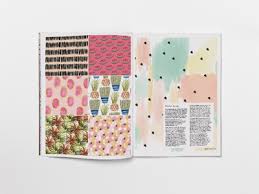
frankie magazine is a bi-monthly Australian magazine, featuring music, art, fashion, photography, craft and other cultural content. The magazine itself represents a diverse range of interests and people, whilst still maintaining its mainstream reputation. I feel that this is due to its simplistic layout, especially on its front cover; it doesn't attempt to force an ideology on its reader, and is simply focused on reflecting a diverse range of things to its readers.
The light colour scheme and vintage feel of the magazine is an appeal and something which I would use in my magazine, due to the fact that it gives the magazine a fun and light-hearted feel which is aesthetically pleasing therefore enticing the audience to want to read the magazine.
https://player.vimeo.com/video/125521102
Some of the videos available on the magazine's website reflect its ethos and beliefs, which is something that I would use in option B as a sort of advert within the video, or as a way for whoever is being interviewed to express / sell their magazine. An appeal of the magazine is the fact it is able to make niche interest points seem mainstream, and it makes a wide range of texts more available to its audience. This again is something I would strive to do and could do this through the audio visual element as it is probably easier to verbally express the ethos and aims of the magazine in a succinct way, than by writing it as it could take away from the main article.


Comments