Magazine Research - British GQ
- Media Bloggers
- Aug 21, 2025
- 4 min read
British GQ March 2025 Cover
British GQ, which is published by Condé Nast, is a magazine focused on men’s lifestyle and fashion that combines celebrity culture with style and luxury. The cover featuring Michael B. Jordan illustrates this, showcasing him as both an aspirational figure and an influential personality, which is key to GQ’s brand identity.

The design adheres to established genre conventions. A prominent masthead takes centre stage at the top, while striking cover lines intertwine cultural topics with lifestyle and fashion themes. The studio shoot employs metallic hues and intense lighting to craft a sleek and futuristic look, reinforcing GQ’s connection to sophistication and high status.
Michael B. Jordan is depicted as confident, playful, and powerful. His pose, direct gaze, and smile, along with his jewellery, designer watch, and high fashion attire, emphasize wealth and style. This portrayal also signifies Black excellence in luxury fashion, highlighting diversity and resonating with a Gen Z audience that prioritizes inclusivity and visibility.
The media language supports this portrayal. Close up shots accentuate his presence, while cool tones and metallic textures convey modernity and strength. The headline “Reveals His Master Plan” piques curiosity and positions Jordan as strategic and influential, elevating him beyond just a celebrity to an authoritative figure.
This resonates with GQ’s readership of young professionals and style-savvy individuals. Gen Z is attracted to both aspirational lifestyles and cultural significance, and the cover effectively balances these elements. It promotes success and exclusivity while also engaging with wider cultural discussions.
Key aspects to take note of include the strong central portrait, bold styling, and the blend of celebrity glamour with more profound cultural stories. Theoretical frameworks are also relevant: Stuart Hall’s representation theory illustrates how Jordan is portrayed as both aspirational and relatable, while Richard Dyer’s star theory emphasizes how his meticulously crafted image boosts his charisma and influence.
Double Page Spread

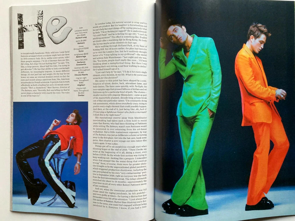
This British GQ double page spread showcases Robert Pattinson in a bold and unique manner, highlighting the magazine’s emphasis on high fashion and daring creativity. The design combines detailed text analysis with lively, editorial style photography, merging journalistic insight with striking visual appeal.
The selection of suits in neon green and bright orange makes Pattinson pop, defying conventional masculine fashion standards and reinforcing GQ’s mission to challenge norms. The vivid colours represent individuality and rebellion, which aligns with Pattinson’s own image of taking unconventional roles. The smaller photo of him lounging in a red sweater and shiny striped pants adds more variety, offering readers a deeper look at his style and character.
The text portrays Pattinson as both mysterious and relatable. It emphasizes his departure from typical blockbuster roles while showcasing him as a thoughtful, adventurous actor. This resonates with GQ’s audience, who appreciate not only celebrity glamour but also authenticity and transformation.
The language used in the media is carefully crafted throughout the spread. The oversized suits and bright colours, combined with casual poses, create an almost dreamlike quality, suggesting creativity, confidence, and fun. The photography depicts him as both fashionable and friendly, presenting an alternative masculinity that attracts Generation Z, who often embrace fluidity in gender expression and identity.
This portrayal is inclusive and forward-thinking, demonstrating that male identity in fashion isn’t confined to traditional norms. It also reflects how magazines like GQ strive to encourage readers to view style as a means of self-expression rather than mere conformity.
The spread captivates audiences by blending aspirational fashion with cultural significance. Stuart Hall’s representation theory helps clarify how meanings are embedded here, positioning Pattinson as a symbol of individuality.
British GQ Website

The homepage of the British GQ website is crafted to catch your eye right away, featuring striking images and a grid layout that feels quick, contemporary, and suited for digital readers. At the top, a banner showcases a feature story with a cinematic image, highlighting GQ’s focus on high-quality production and visual storytelling.
Below that, the page is neatly organized into sections, top Stories, GQ Hype, Fashion, Culture, Wellness, Fitness and each one designed with bold visuals before any text. This emphasis on images mirrors Gen Z’s scrolling habits, where pictures take precedence and headlines serve as enticing hooks.
The representation on the homepage aligns with GQ’s brand image of style, luxury, and aspirational living. Male figures are prominently featured, often dressed in high fashion, reinforcing notions of sophistication and success. However, there’s also a noticeable move towards inclusivity, with content on wellness, Pride, and fitness, indicating GQ’s response to evolving concepts of masculinity. Stuart Hall’s representation theory is apparent here the site presents aspirational images of men that blend traditional style with modern values of diversity and lifestyle awareness.
The media language on the site is lively and engaging. Brief headlines, linked images, and embedded videos promote quick interaction and continuous clicking. This reflects convergence culture, where magazines modify print content for an online environment that competes with platforms like Instagram, TikTok, and YouTube. Richard Dyer’s star theory is also relevant, as many articles centre around celebrities actors, musicians, athletes whose curated images attract reader interest.
Toby Braithwaite


Comments