

Magazine Research - Crack
- Media Bloggers
- Aug 18, 2025
- 6 min read
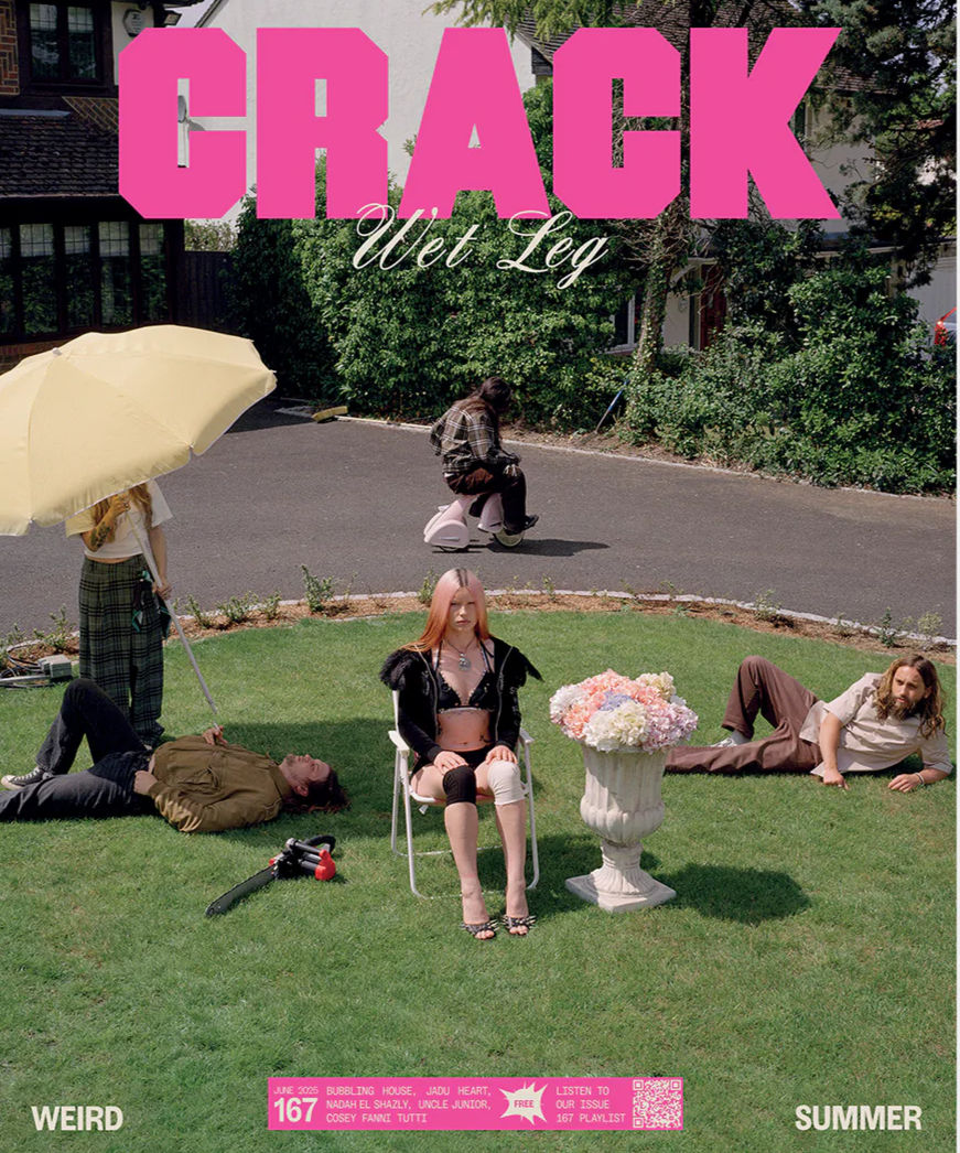
Front Cover - Wet Leg June 2025 Crack Magazine is an independent publication from the UK that focuses on alternative music, art, and culture. It's free and is well known for supporting underground and experimental artists. The cover featuring Wet Leg captures this essence by presenting the band in a fun and unconventional manner.
The magazine covers music and culture, particularly indie and alternative genres. Unlike mainstream publications, Crack steers clear of glossy, polished images of celebrities. Instead, it embraces a quirky and artistic design, which gives it a more genuine and creative vibe.
The cover adheres to alternative conventions with its bold design, minimal text, and unique photography. The large pink masthead stands out prominently on the page, while the image takes precedence over the cover lines. This indicates a focus on visual impact rather than relying on a lot of text to sell the magazine.
The band is photographed in a suburban driveway and garden. Everyday items like a lawnmower, an umbrella, and flowers are used in unexpected ways, adding humour and irony. The ordinary setting contrasts with the surreal poses, giving the cover a quirky and playful feel.
Wet Leg is depicted as eccentric and funny, rather than glamorous. Their awkward poses and casual appearance challenge the typical media portrayals of artists. This makes them seem authentic and relatable, which aligns with alternative values and their usual representation they have as a band.
The cover primarily targets young adults, appealing to Generation Z readers. While ethnicity and sexuality aren't the main focus, the quirky and ironic tone reflects Gen Z's values of inclusivity, creativity, and rejecting stereotypes.
The use of bright natural light, casual outfits, and surreal props creates a unique look. Typography also plays an important role: the masthead "CRACK" is bold and blocky in pink, while "Wet Leg" is written in elegant script. This mix of styles contributes to the playful and experimental aesthetic.
The cover attracts Gen Z because it is unique, ironic, and unlike typical magazines. Its humour and oddness help it to stand out, drawing in readers who prefer individuality and alternative culture over sleek, commercial visuals.
From this cover, I would borrow the bold and eye catching typography that instantly captures attention. I would also draw inspiration from the minimal text usage, which lets the main image stand out and make an impact. Another aspect worth taking is the surreal incorporation of everyday objects, which brings irony and humour to the visuals. Additionally, I would mimic the fun and unconventional poses of the artists, which generates curiosity and distinguishes the magazine. Lastly, I would combine regular settings with experimental visuals to develop a unique and unforgettable style.
Postmodernism is expressed through irony, parody, and bricolage, transforming suburban life into something surreal. Stuart Hall’s representation theory is relevant here, as Wet Leg is depicted outside the usual stereotypes of glamour. Audience reception theory indicates that Gen Z interprets this cover as genuine and quirky, whereas mainstream audiences may perceive it as confusing or strange.
Crack Magazine Double page spread

The article centres on sustainability in DJ culture, illustrating Crack’s dedication not just to music but also to larger cultural and social matters.
While the genre remains music and culture, this feature emphasizes how the magazine frequently connects music with political or social issues. By addressing climate change, Crack goes beyond mere music reviews and delves into topics that resonate with younger audiences.
The double-page layout adheres to the norms of alternative music journalism. It features a lengthy interview, bold fonts, and thoughtfully arranged photographs. The prominent, vertical title on the left page “What does it mean to be a sustainable DJ?” is eye catching and innovative. This unique design shows Crack’s indie aesthetic, which often defies conventional magazine formats.
The visuals depict the DJ in relaxed, everyday environments one close-up portrait and another atmospheric image of a chaotic dancefloor littered with plastic cups. These scenes directly relate to the article’s theme: the disparity between glamorous music events and their environmental repercussions.
The DJ is portrayed as reflective and socially aware, rather than just a performer. He is depicted as someone who is concerned about his effect on the planet. This stands in stark contrast to the usual portrayals of DJs as party figures or indulgent personalities. Instead, Crack showcases him as an activist, thinker, and a role model for change in music culture.
This spread illustrates DJs and the broader dance music community as capable of social responsibility and activism. It particularly resonates with young, socially aware readers (mainly Gen Z), who are invested in environmental matters. By emphasizing sustainability, the magazine portrays its audience as ethical, forward thinking, and politically active.
This article targets Crack’s Gen Z audience by connecting music culture with activism. Young readers are usually very aware of climate change, and this feature highlights that DJs who they look up to are also involved in this issue. The layout is designed in a bold, modern style, which fits the creative and experimental preferences of its audience.
From this layout, I would take inspiration from the bold and experimental typography to create a strong visual effect. I would also implement the Q&A format, which makes the article more straightforward and engaging for readers. Including relevant and striking images that relate directly to the theme is another aspect worth incorporating. Lastly, I would utilize pull quotes to highlight key points and capture the reader’s attention.
Stuart Hall’s representation theory applies here as the DJ is portrayed as an activist and thinker, which challenges the usual stereotype of DJs as carefree or irresponsible. Gauntlett’s identity theory is also applicable, as the feature illustrates how DJs and their audiences can use culture to form their identity around sustainability and activism. Audience reception theory indicates that Gen Z readers will likely respond positively, viewing Crack Magazine as resonating with their values and concerns.
Crack Magazine website
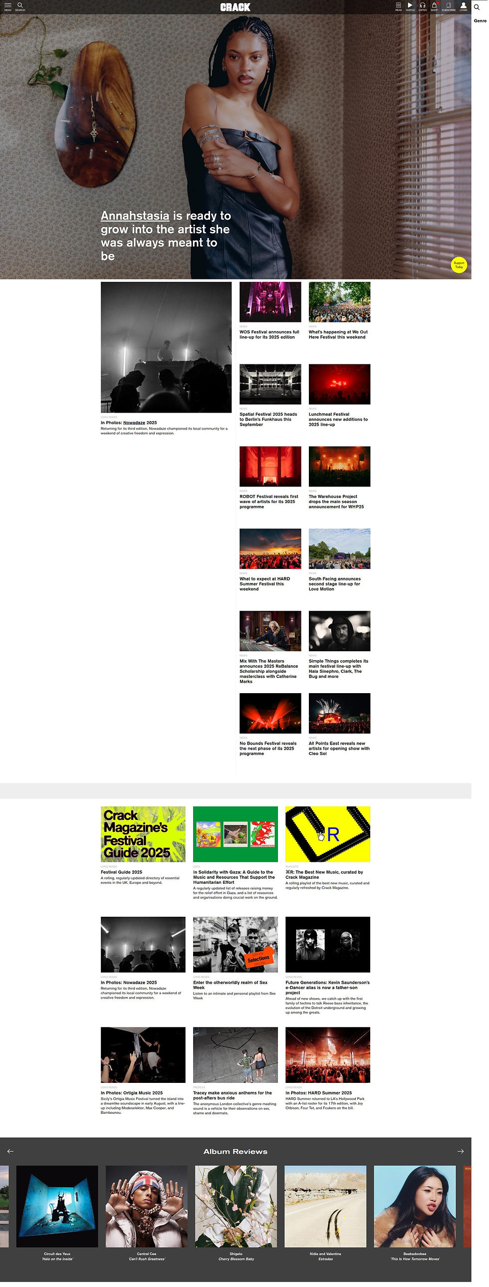
The website follows the style of online magazines, featuring a homepage that showcases a main story with a large, eye catching image and a bold headline, followed by various clickable news articles, interviews, and reviews. In contrast to commercial pop culture sites, Crack has a minimalist and editorial design, emphasizing negative space and photography.
The main story features an artist in a creatively styled indoor photoshoot, while other sections focus on live performances, festivals, and cultural venues. The visuals alternate between close-up artist portraits and atmospheric images from music events, illustrating the balance Crack maintains between personal narratives and broader music culture coverage.
Artists are portrayed as creative, thoughtful, and genuine individuals instead of mere celebrities. For instance, the headline "Annahstasia is ready to grow into the artist she was always meant to be" presents her as a person with depth, growth, and artistic integrity. The website avoids mainstream glamorous images, opting instead for raw, expressive portraits that align with its indie spirit.
The site caters to its audience primarily Gen Z and young millennials who are culturally curious, politically active, and alternative. The content includes support for Gaza/Palestine, festival culture, and niche music movements, reflecting an audience that appreciates diversity, activism, and underground creativity.
The homepage design is striking yet simple the large images take centre stage, with concise, impactful headlines overlaid. Navigation is straightforward, featuring categories like news, reviews, and features. Photography plays a crucial role in Crack’s identity the images are artistic and expressive, matching the magazine’s alternative brand. The combination of longform text features and visual stories, such as photo essays from festivals, showcases Crack’s hybrid style.
The website targets Crack’s main audience, which includes Gen Z and young millennials, by highlighting underground music, activism, and culture. The homepage features a blend of festival announcements, political solidarity articles, and experimental photography, appealing to an audience that views music as part of a broader lifestyle and identity. Crack’s design is minimalistic, artistic, and less commercial compared to mainstream competitors, attracting readers who appreciate authenticity and independence.
From this site, I would take inspiration from the bold images on the homepage that grab attention right away. I would also implement short, catchy headlines that spark curiosity. Another aspect worth adopting is the combination of personal artist profiles with cultural and political content, which enhances its appeal. Lastly, the minimalist, editorial design could make my coursework to appear modern and tidy.
Hall’s representation theory fits here the artists are shown as genuine and socially aware, pushing back against mainstream ideas of fame and celebrity. Gauntlett’s identity theory is also applicable as Crack provides readers with role models and cultural resources to help them explore and shape their own identities. Audience reception theory is relevant too: Crack’s audience, being socially aware and politically active, is likely to view the website’s blend of activism and music coverage in a positive and preferred manner.
Comments