Magazine Analysis - Ourdoor Photography
- Oct 8, 2020
- 2 min read
This magazine is targeting more of a niche audience. It is a magazine that focuses on showcasing ‘wild and wonderful photographs of the world around us’. I think the target audience could be young adults and above of all genders. This magazine is most likely for the explorer (Young and Rubicam’s 4C’s) because their main motivation is discovery. This magazine is showing many different outside places which will lead their audience to discover more.

The choice of putting a well-produced photograph as the cover immediately tells the audience the genre of the magazine. The photograph is quite moody and professional which shows how this magazine is genuine and informational. The front cover being a well composed photograph shows how this magazine has the ability to teach and show their audience. The shadowed middle ground creates interest as the audience may ask ‘how have they done it?’.
The copy ‘30 project ideas’ gives the audience more things they can explore in photography which will be appealing to their audience type. Also it suggests how much knowledge the makers have about the topic.
Outdoor Photography website: https://www.outdoorphotographymagazine.co.uk/

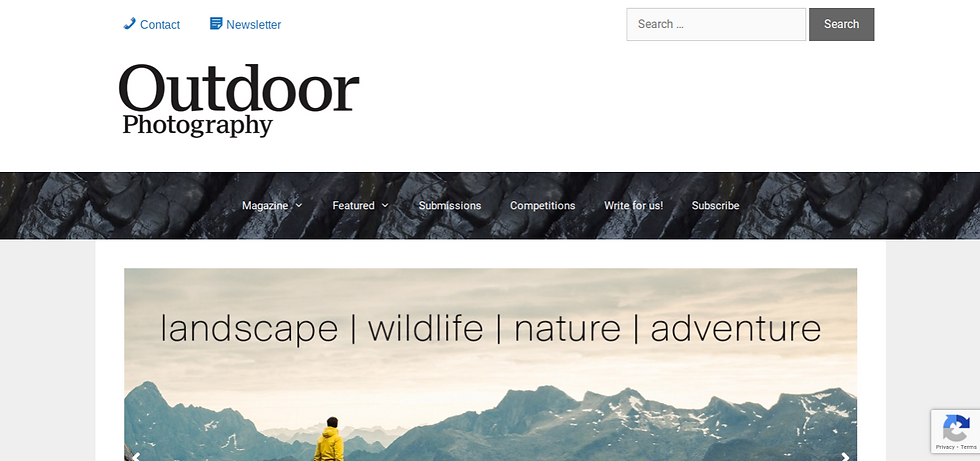
The website is very clean and need. The black copy on the white background gives it a more professional look. The sections bar is a photograph of a tree’s bark, this is giving it a more natural and rural feel which is associated with peace and adventure. The photographs included on the front page are very cinematic and high quality which further suggests how professional and knowledgeable they are.
They also have a submissions section where the audience can submit their photographs. This shows how they value their audience and want them to get involved. Their audience will like this as they can see how they can contribute and it will motivate them to discover.
They have a competitions section which allows their audience to potentially win a prize by know the answer to the question asked. This is more ways in interact with their audience and build more of a connection.


Comments